
I participated in a two-day workshop—Making Tools for Making—conducted by one of our partners, Dhiya, back in 2015. The workshop was central around the idea of creating tools for our personal practice and in my case, the Type Rule was first conceived then. Initially intended as a rule made for my own personal use, it was heartening to observe that fellow designers around me were also delighted at this old familiar tool with a facelift.
The concept of a rule designed for conducting typographical measurements is not new at all, neither are the tools. The tools which are currently available (back then in 2015 and even now 2018) in the market have annoyingly short lifespans and damages easily. Particularly, the reason for the frustration I have using these tools are the poor materials (the easily damaged PVC as well as poor printed markings) and the lack of considered design in the tool’s interface.

Amazon’s answer to a designer looking to purchase a type gauge
Lastly, as a designer, whether you’ve learnt it at school, from your carnivore-turned-vegan friends, or looking at clips of slums atop thrash landfills, we shoulder a huge responsibility as the gatekeepers of sustainable design (something I feel has not been discussed enough openly). This responsibility carries itself throughout the entire design process in any project. A professional tool should last. It should be around to develop a patina of your practices and rituals. Tools are a reflection of our habits (good and bad) and by refining these tools we use, we refine our craft.
The type rule has essentially gone through a few iterations (5 so far) and they are done so after a few months of active usage. I have found this meditated process of prolonged usage followed by refinement to be a smooth and natural one, with every revision being deliberate but not over-considered. There were no note-taking during user-testing nor big decisions during revisions, the process felt more like improving a cooking recipe over time, “less salt, more salt”.
Before I go on further to dive into the specifics of the rule, please allow me to write briefly about our approach towards the sale of these rules. After SWELL decided that we started to produce these rules in small quantities for sale, I immediately wanted the rule to be affordable for students of design. I am insistent that this object of design is a tool that puts function before form, rather than a novelty object. The type rule has been priced to cover material and man-hour costs (hand-coloured and hand-sewn pouch), without your hipster markups. This is a considered, useful and economical tool that will hopefully last you.
Form & Functionality
“This type rule is made with the sole intention of deconstructing typographic material, aiding you in your daily design tasks and making critical decisions concerning printed type. It strives to help users develop and solidify approaches towards their practice.”
Of the several reasons that propelled me to design a type rule, the interface design was the first issue I wanted to address. It was aggravating to position flimsy sheets of PVC on top of prints, followed by sliding it around in order to get to the appropriate gauge to take a measurement. Eventually, when the gauge nears the end of its lifespan, I come to realise that much of the product has not been utilised. This I observed and have come to conclude over time, is not due to the gauge being “old-school” or “outdated”, but rather excessive clutter. Overlapping functions on the gauges were not streamlined but rather repeated. This I noticed to have had a profound effect on one’s craft; the lack of a streamlined interface design makes the tool lazy and inevitably, the user sloppy.
Like most designers who have a thing for printed type, we are schooled by Robert Bringhurst’s very important book, Elements of Typographic Style, and this type rule was designed under that framework. Unnecessary and less-than-important functions were benched to make way for a compact yet streamlined interface. The functions on the type rule (2018 version) are as follows:
- Type Gauge
- Leading Gauge
- Point Gauge
- Point Rule
- Rule in millimetres (0.5 mm)
- Rule in inches (1/32 in)
- Rule in picas (0.5 pi)

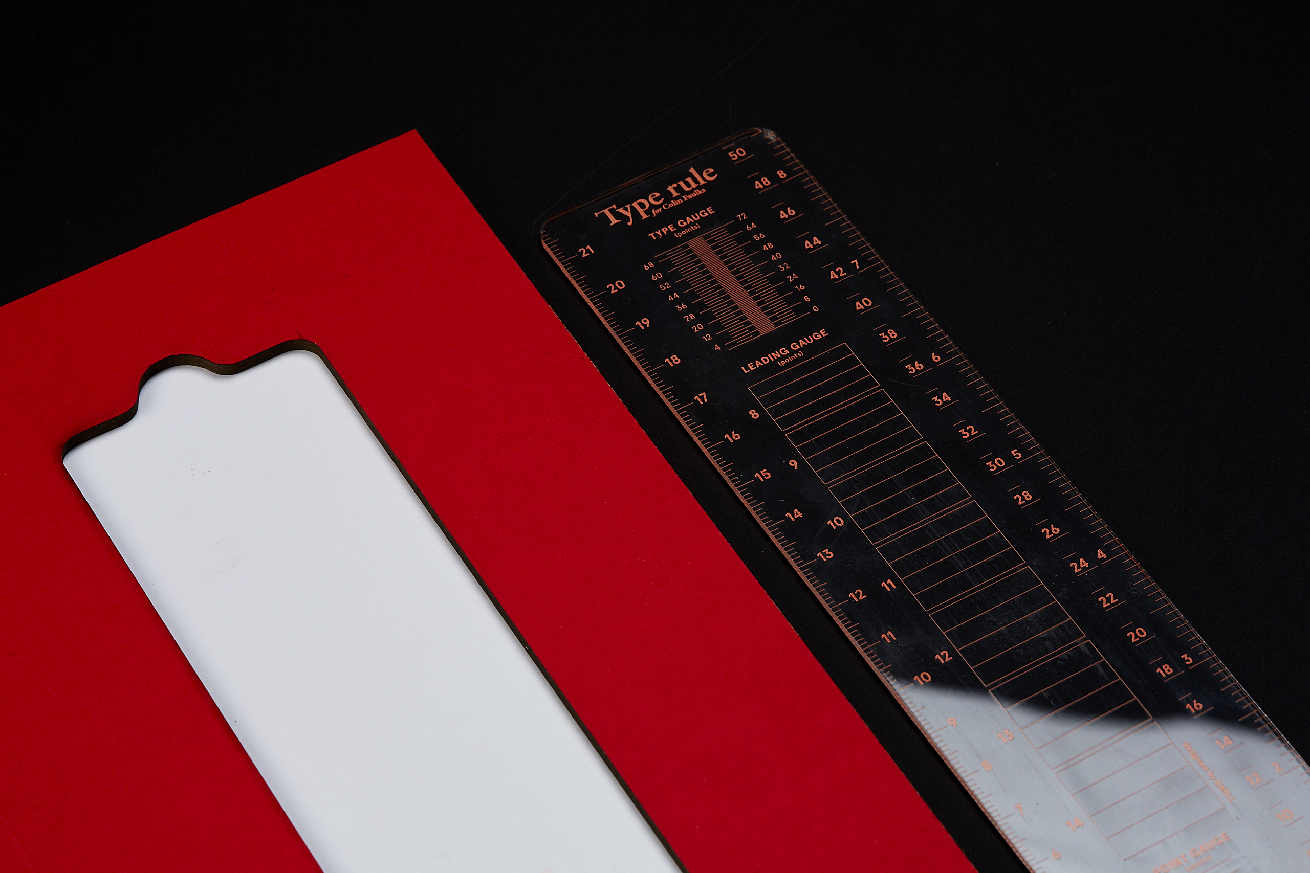
Type Gauge
The type gauge’s sole function is to measure the effective type size of printed type. The horizontal width of the gauge spans 4 picas, which by average, will be sufficient for lining up ascenders and descenders on a line of body text to take measurement. Unlike conventional gauges which lets you take an optical reading of type sizes, making precise measurement like this has given me a better understanding of the relationship between my typesetting work on screen translated onto printed mediums.

Leading Gauge
The leading gauge is simply used for measuring body text leading. Currently, only leading gauges of point size 8, 9, 10, 11, 12, 13 and 14 is provided. This seven leading sizes are just so because they are the ones that I commonly employ in type setting large body texts. Future revisions might see the removal of 14 point leading gauge.
For leading measurements that fall out of the provided range, the measurement can be easily performed with the type gauge.
Point Gauge
Whilst this is the least used portion when it comes to the common design tasks I encounter, I have found this necessary when handling large outdoor display type. Alternatively, I have also found it useful for the consideration of indenting extra space. The latest version of the type rule has seen the elimination of the typically use square and circular shaped marks for this gauge. Horses or zebras, either way it’s a stampede, a simple rectangle does the job just fine.
Rules in three metrics: Millimetres, inches, points and picas
What would a rule be without sides that measure length? While being rather self-explanatory, the rules require the user to register their measurement at zero point rather than the bottom end of the rule. (i.e. Zero begins a little above the bottom edge of the ruler)
The point rule located at the bottom of the tool serves the purpose of making precise measurements such as indentation spaces, gutter space, etc.
The inclusion of pica units is a decision out of convenience as it is often a unit I employ in measuring line length when considering the relationship between text block size, type size and track setting.
Materiality
It was immediately apparent that the rule had to be fully transparent in order to achieve it functionality. No one likes a metallic rule with dicut keyholes for taking measurement. Apart from visual considerations, the tool’s longevity is highly dependent on the material’s resistance to scratches. A few different acrylic materials were considered and eventually I landed on this inexpensive scratch-resistant 2mm acrylic.
It was also not rocket science and meeting rooms to arrive at 2mm thickness, it just felt right when comparing all the different ones I tried.
Construction
It goes without saying that to achieve accuracy and sharpness in mark making on a piece of acrylic, laser C&C was the answer. The edge of the rules will be buffed slightly so that they don’t cut your hands during usage.
In order to avoid the same issues I had with printed markings that fade over time from friction, the laser etching has been configured to achieve a very mild ink trap for colouring to sit into. There has been no cases so far of fading marks.
Florescent orange acrylic paint is applied onto the rule (finger-painting style) to avoid scratching the surface as well as ensuring a generous pigment coating on each mark.
In case you’re wondering, we have tried many colours and this has been the best across all attempts.
Usability
Although I have to be honest that leaving the rule in your bag full off other Knick-knacks disfigures the rule pretty fast, the “scratch-resistant” material is not as advertised or is rather subjective. This is why a snug pouch sewn personally by yours truly comes along with every type rule. Just like the intention behind colouring by hand, sewing the pouches myself keeps cost low and affordable. The pouch is made from synthetic PVC leather that does not damage the rule when holding it.
Despite all the iterations I have made on the rule over the years, I am still primarily using the first rule I created 3 years ago. Though beaten and scratched, I have never felt encumbered using my OG type rule even today.
Future iterations might, something that has always been on my mind, see the addition of an attachable loupe for magnification purposes.
Cosmetics
The rule is ultimately a tool of precise measurements and specialised usage. I use two of my favourite typefaces on it with clean hairlines and minimal design. This rule is meant to be used, not displayed.
Looking forward
I hope that this project does not end here with the type rule. SWELL will be working on expanding the set of stationary specialised in performing design tasks. Meanwhile, we are taking in orders for the type rule so if one is interested, please kindly drop an email to store@swell.sg with your order details. Each type rule is priced at SGD$20.00 less postage costs and it comes along with a snug protection pouch.
Should you wish to discuss with me about possible refinements / modifications or perhaps request for the working files of the rule, email me at benson@swell.sg
Cheers!
Benson Chong